How to display list data in SharePoint 2010 chart web part
17 December 2011
In this exercise I will show you how to use the Chart Web Part to provide a simple way to provide charts on a Web Part page so that users can visualize data in native lists within a SharePoint site as well as external lists created with the BCS, I have create a simple list for chart data, but keep in mind that you can use data from backend systems like using BCS external content types.
I have created a list called “Sales list” which has two main columns, “Country” and “Revenue” with some data in it, as shown in below image.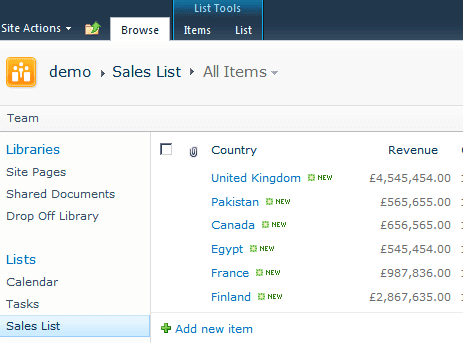
The Chart Web Part is part of the Enterprise Edition of SharePoint Server 2010. Therefore, you must activate an enterprise feature on your site collection before using chart web part.
Activate Enterprise Features
Go to Site Actions > Site Settings
Select “Site collection features” under “Site collection Administration” section
Activate feature called “SharePoint Server Enterprise Site Collection features”
Navigate back to the Site setting page
Select “Manage site features” under “Site action” section
Activate the feature called “SharePoint Server Enterprise Site features”. Activation of these features makes the Chart Web Part available to use.
Adding and configuring Chart Web Part
Go to site home page or where you want to add web part.
Select “site action” > edit page
Click on “Add a web part”
Select the “Chart Web Part” from the “Business Data” folder and click the Add button place I ton the page.
Once the Chart Web Part has been added to the page, you should see a link with the caption of Data & Appearance. Click on the link which will launch a wizard and will allow you to select a data source.
On the first page of the wizard, click the link “Connect chart to data”.
Now select a data source. Choose “Connect to a List” and click “Next”.
On the next page it ask you to choose a source list, in my case it will “Sales list”
Next page will show you the data from list just click “Next”
In the final wizard Page it will ask to bind your chart with the select,
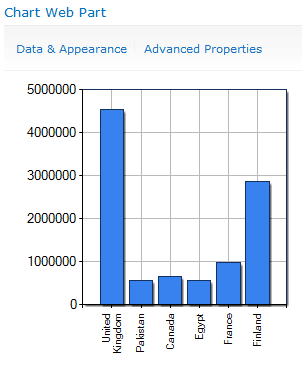
You need to select X and Y filed from the list, In my case
Y Field: Revenue
X Field: Country
After you bind list column with chart click “Finish”
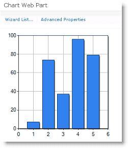
You will see the basic chart as shown below.
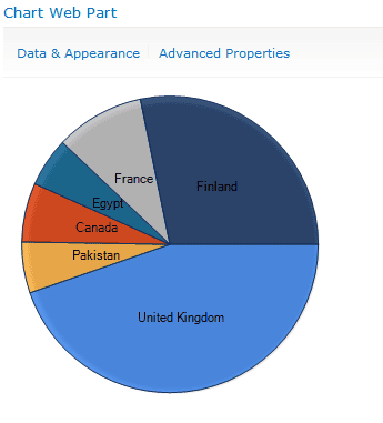
Note: If you want to change chart type (e.g. pie chart, lines chart), on the first page of the wizard click “Customize Your Chart” and select your shape and click “Finish”. J
I have customized chart type to pie later as shown below.